BNNVARA _ MERCHING TWO PUBLIC BROADCASTERS
Identity Design
_________________________________
Client: BNNVARA
Identity: Dutch Public Broadcasting Channel
Scope: Brand Identity. Creative Direction.
Collab: Dog and Pony, Amsterdam
BNNVARA _ MERCHING TWO PUBLIC BROADCASTERS
Identity Design
_________________________________
Client: BNNVARA
Identity: Dutch Public Broadcasting Channel
Scope: Brand Identity. Creative Direction.
Collab: Dog and Pony, Amsterdam
BNNVARA _ MERCHING TWO PUBLIC BROADCASTERS
Identity Design
_________________________________
Client: BNNVARA
Identity: Dutch Public Broadcasting Channel
Scope: Brand Identity. Creative Direction.
Collab: Dog and Pony, Amsterdam
BNNVARA _ MERCHING TWO PUBLIC BROADCASTERS
Identity Design
________________________________
Client: BNNVARA
Identity: Dutch Public Broadcasting Channel
Scope: Brand Identity. Creative Direction.
Collab: Dog and Pony, Amsterdam
BNNVARA _
MERCHING TWO PUBLIC BROADCASTERS
Identity Design
_________________________________
Client: BNNVARA
Identity: Dutch Public Broadcasting Channel
Scope: Brand Identity. Creative Direction.
Collab: Dog and Pony, Amsterdam
BACKGROUND
BNNVARA is one of the major television broadcasting companies in the Netherlands. Being a merger between the young and rebellious BNN on the one side and the more traditional ‘left wing’ VARA on the other, BNNVARA is an important content provider for more progressive viewers of the nation. BNNVARA is a cross media platform active on TV, Radio and various digital platforms such as their homepage, YouTube Channels, and social media pages.
OBJECTIVE
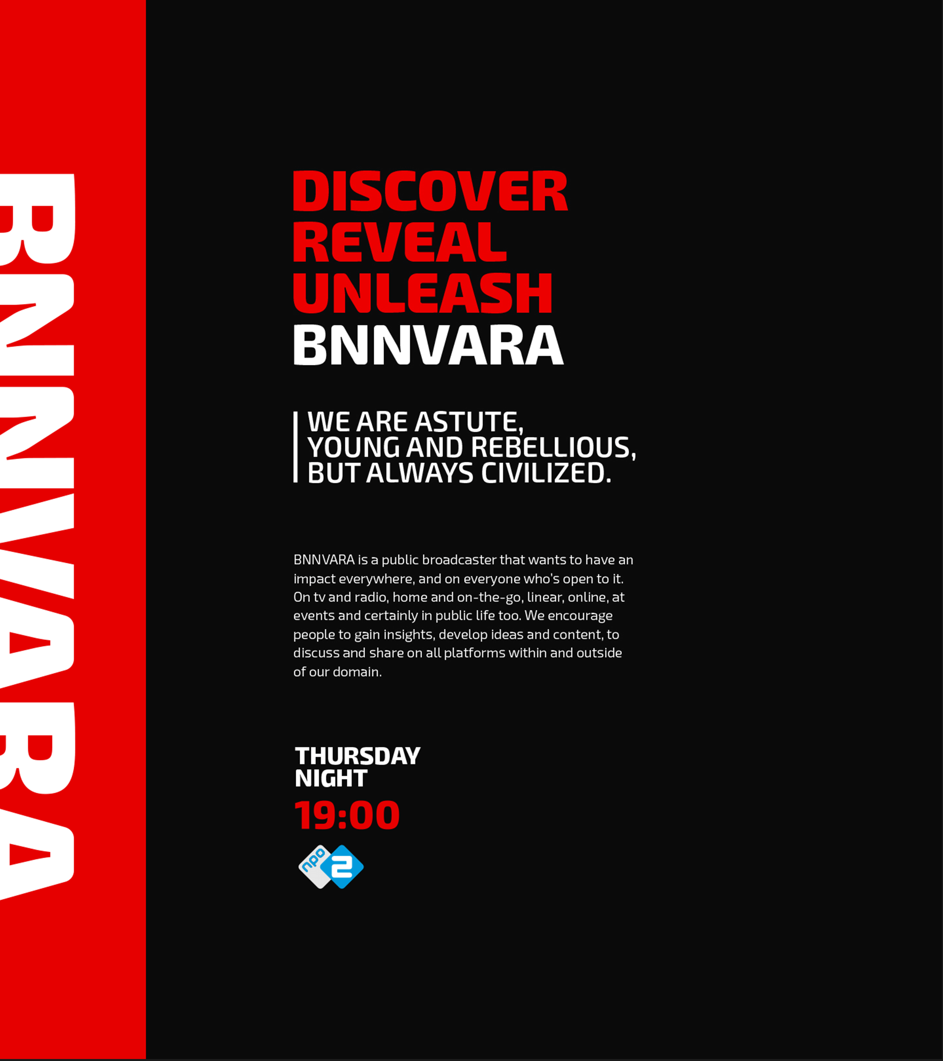
We were asked to develop a new visual identity, based on their new brand story and strategy, which resulted in an internal transformative purpose: Discover, reveal, unleash. Our aim was to highlight the attitude that unites the two organisations, being their recognizable rebellious character as well as their sophisticated way of communicating to their audience.
APPROACH
As the BNNVARA identity will live on various platforms we included motion, and sonic from the beginning of development. Approaching the identity as a living brand designed for the senses.
BACKGROUND
BNNVARA is one of the major television broadcasting companies in the Netherlands. Being a merger between the young and rebellious BNN on the one side and the more traditional 'left wing' VARA on the other, BNNVARA is an important content provider for more progressive viewers of the nation. BNNVARA is a cross media platform active on TV, Radio and various digital platforms such as their homepage, YouTube Channels, and social media pages.
OBJECTIVE
We were asked to develop a new visual identity, based on their new brand story and strategy, which resulted in an internal transformative purpose: Discover, reveal, unleash. Our aim was to highlight the attitude that unites the two organisations, being their recognizable rebellious character as well as their sophisticated way of communicating to their audience.
APPROACH
As the BNNVARA identity will live on various platforms we included motion, and sonic from the beginning of development. Approaching the identity as a living brand designed for the senses.
BACKGROUND
BNNVARA is one of the major television broadcasting companies in the Netherlands. Being a merger between the young and rebellious BNN on the one side and the more traditional 'left wing' VARA on the other, BNNVARA is an important content provider for more progressive viewers of the nation. BNNVARA is a cross media platform active on TV, Radio and various digital platforms such as their homepage, YouTube Channels, and social media pages.
OBJECTIVE
We were asked to develop a new visual identity, based on their new brand story and strategy, which resulted in an internal transformative purpose: Discover, reveal, unleash. Our aim was to highlight the attitude that unites the two organisations, being their recognizable rebellious character as well as their sophisticated way of communicating to their audience.
APPROACH
As the BNNVARA identity will live on various platforms we included motion, and sonic from the beginning of development. Approaching the identity as a living brand designed for the senses.
'A visual system to show BNNVARA content across all platforms'
'A visual system to show BNNVARA content across all platforms'
'A visual system to show BNNVARA content across
all platforms'
'A visual system to show BNNVARA content
across all platforms'
'A visual system to show BNNVARA content across
all platforms'
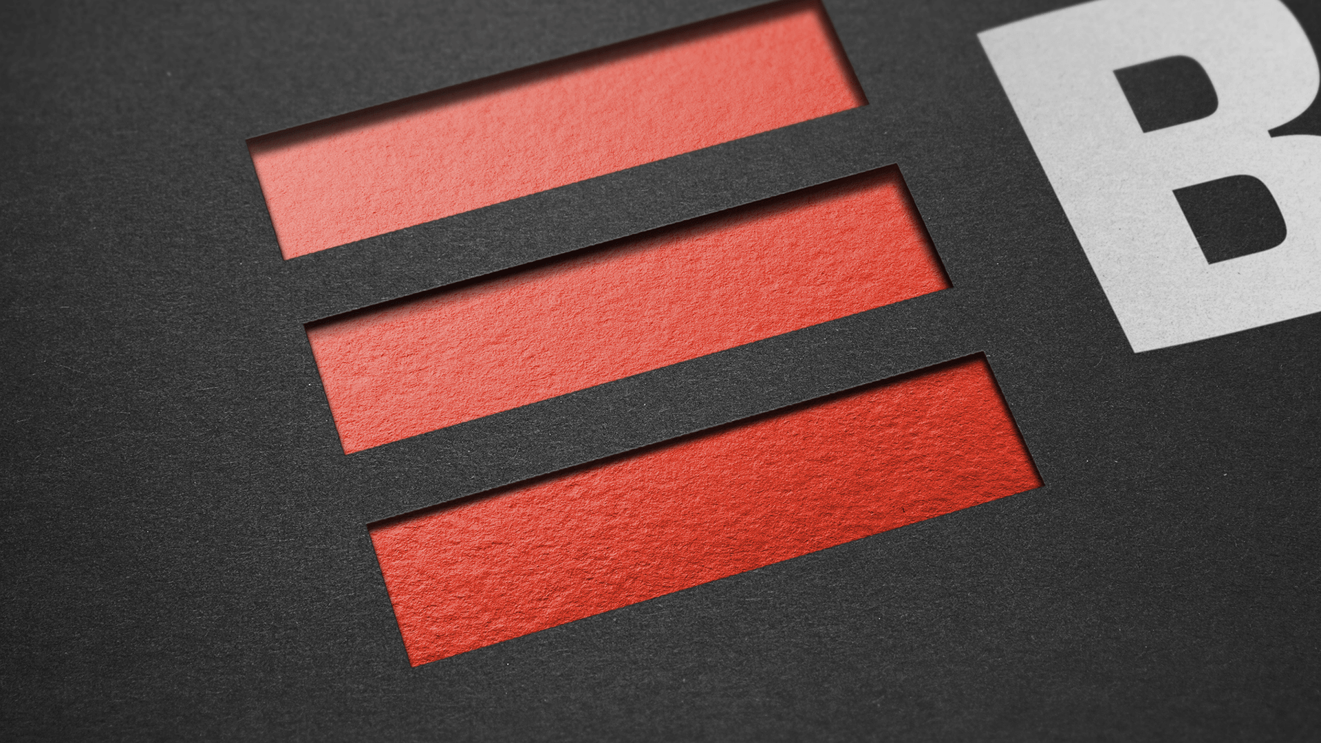
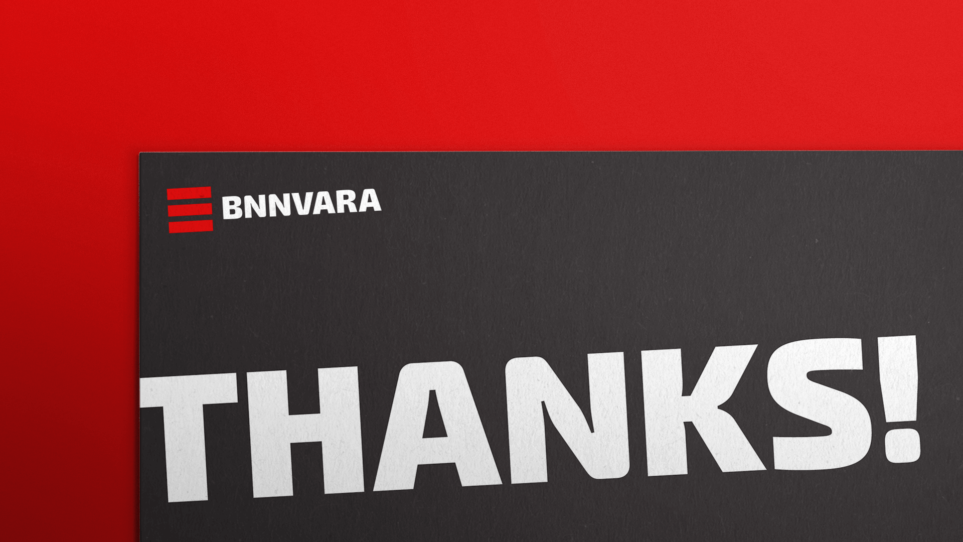
THE LOGO
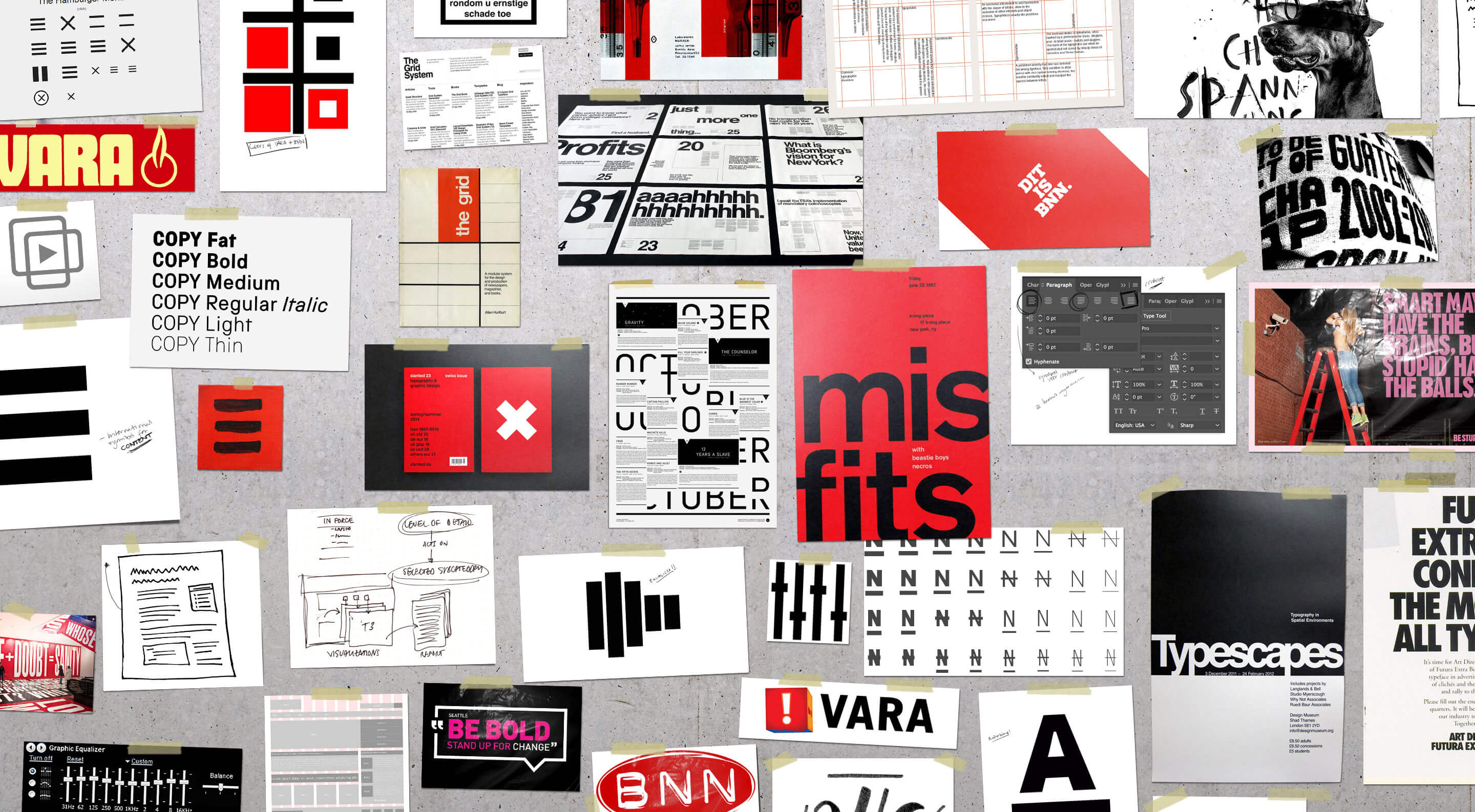
The logo was set out to be iconic, clean and flexible. For a brand, which main purpose is to deliver high quality content to its audience, what would a better symbol to use than the internationally recognized icon for ‘content’ (in some communities better know as the ‘hamburger menu’)? To claim that symbol in the Dutch media landscape is simply a demonstration of the rebelliousness and guts of BNNVARA.
THE LOGO
The logo was set out to be iconic, clean and flexible. For a brand, which main purpose is to deliver high quality content to its audience, what would a better symbol to use than the internationally recognized icon for ‘content’ (in some communities better know as the ‘hamburger menu’)? To claim that symbol in the Dutch media landscape is simply a demonstration of the rebelliousness and guts of BNNVARA.
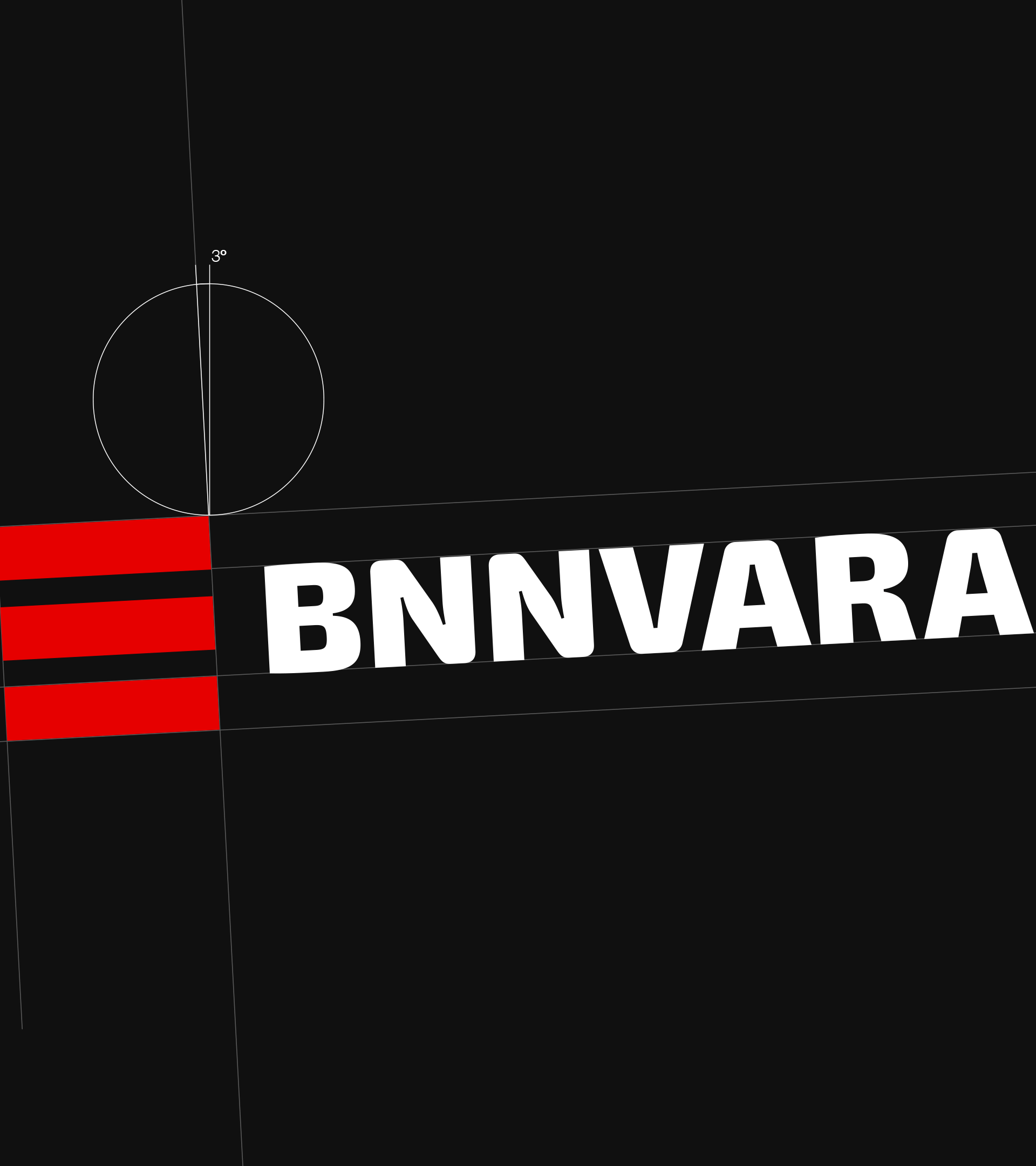
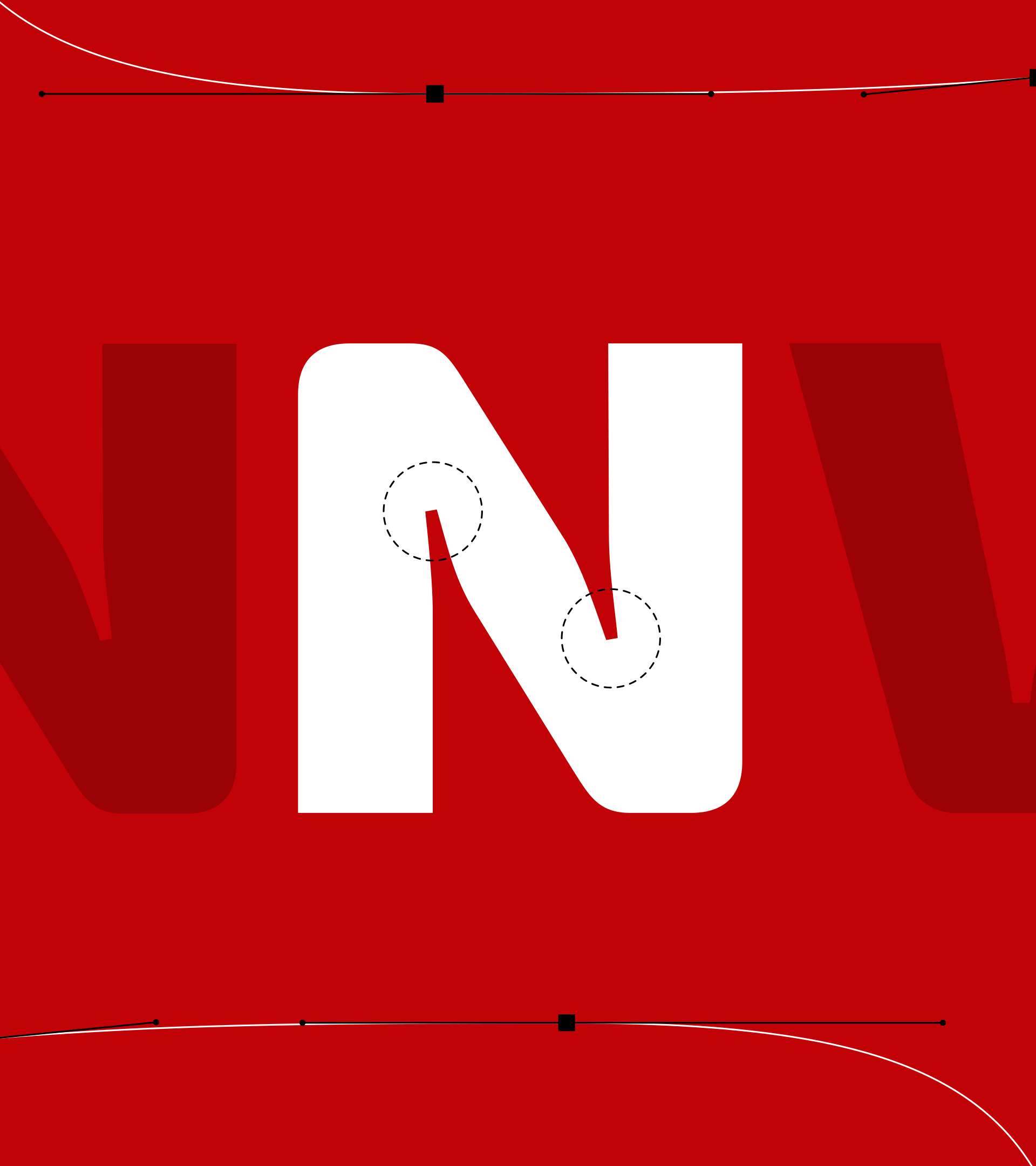
TYPOGRAPHY
We asked Portuguese type designer Natanael Gama to design a custom type for this project, based on his bold and playful font 'EXO2'. The result, EXO BNNVARA, is especially fit for usage on screens, due to the extended ink traps which also add unicity to the font.
TYPOGRAPHY
We asked Portuguese type designer Natanael Gama to design a custom type for this project, based on his bold and playful font 'EXO2'. The result, EXO BNNVARA, is especially fit for usage on screens, due to the extended ink traps which also add unicity to the font.
TYPOGRAPHY
We asked Portuguese type designer Natanael Gama to design a custom type for this project, based on his bold and playful font 'EXO2'. The result, EXO BNNVARA, is especially fit for usage on screens, due to the extended ink traps which also add unicity to the font.
TYPOGRAPHY
We asked Portuguese type designer Natanael Gama to design a custom type for this project, based on his bold and playful font 'EXO2'. The result, EXO BNNVARA, is especially fit for usage on screens, due to the extended ink traps which also add unicity to the font.
TYPOGRAPHY
We asked Portuguese type designer Natanael Gama to design a custom type for this project, based on his bold and playful font 'EXO2'. The result, EXO BNNVARA, is especially fit for usage on screens, due to the extended ink traps which also add unicity to the font.
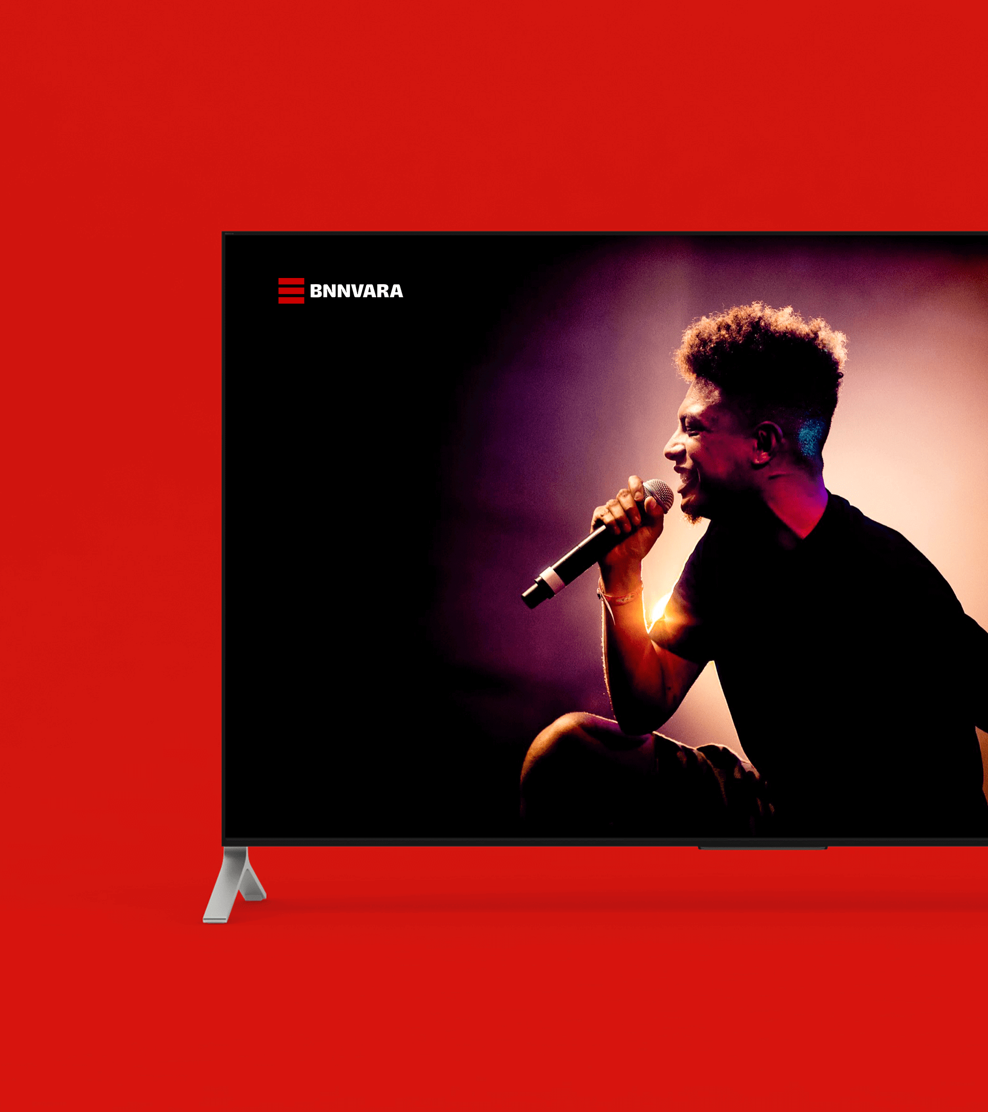
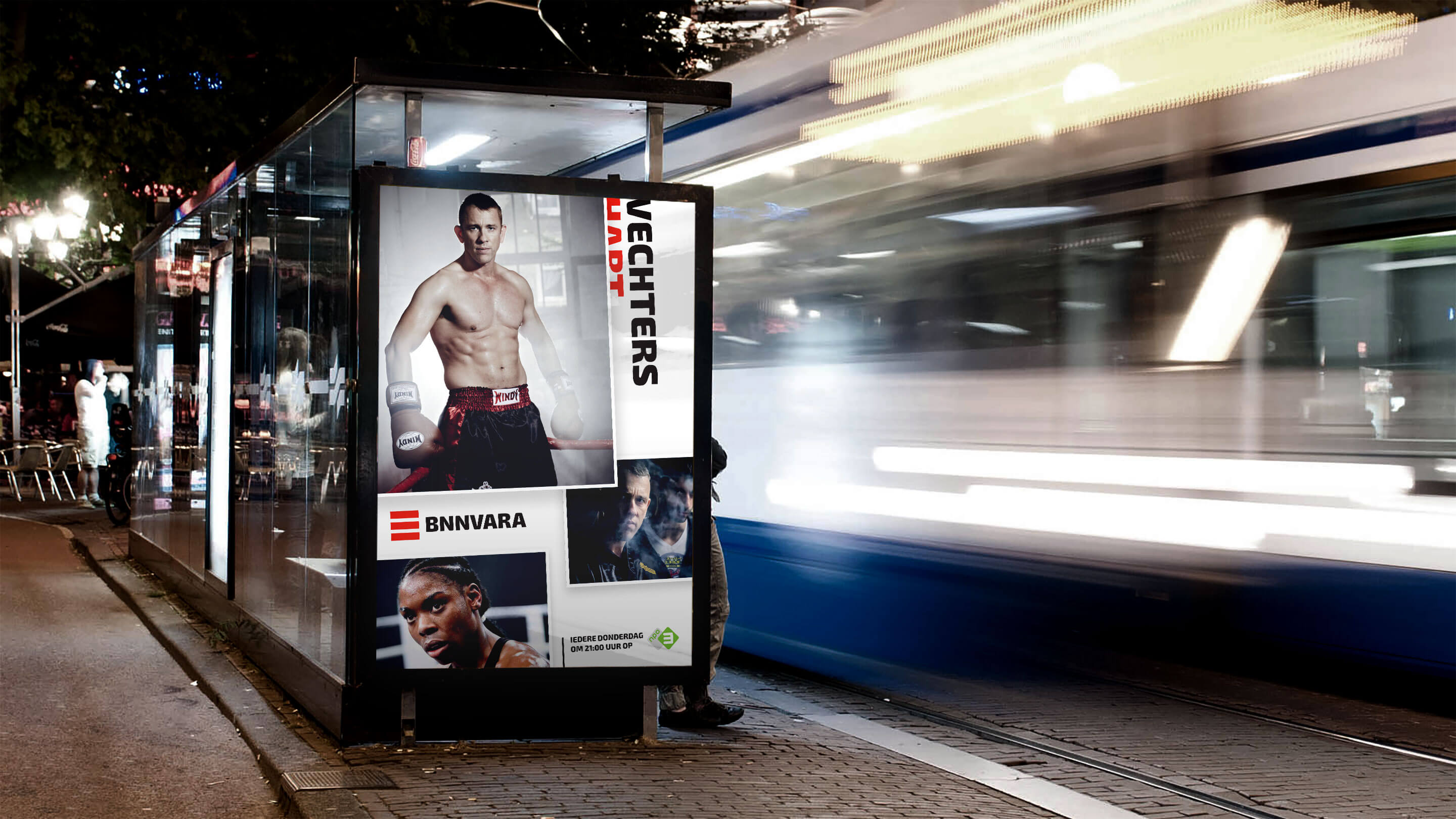
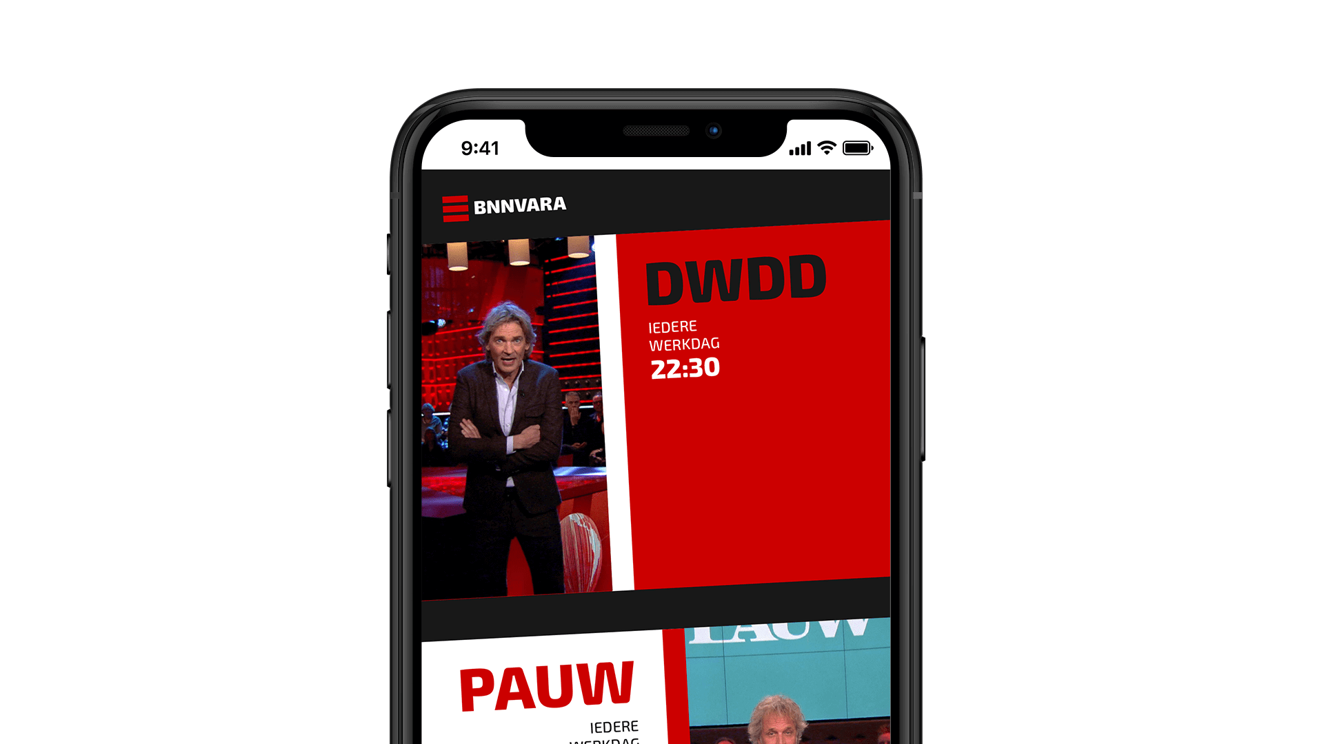
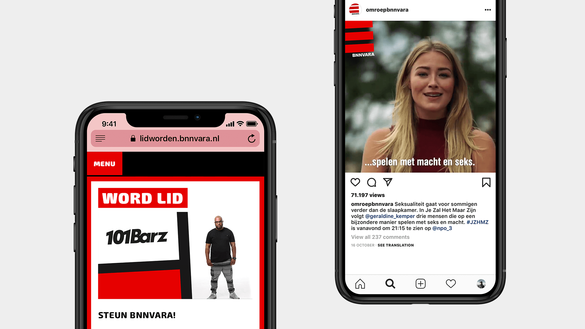
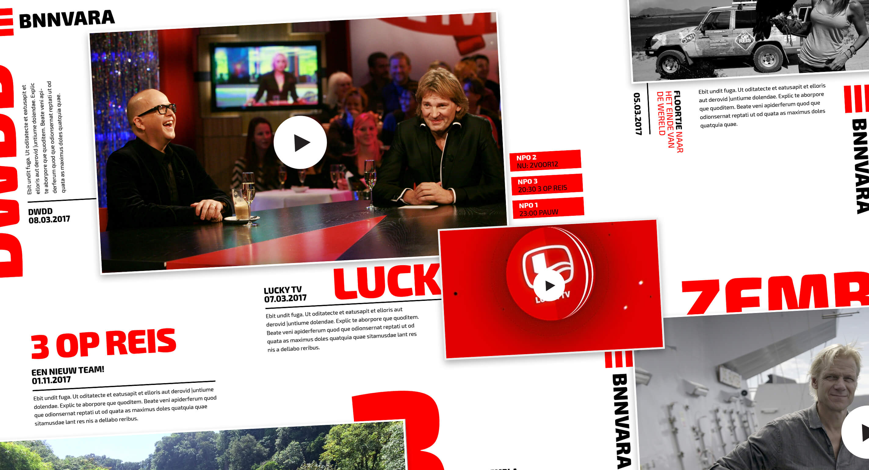
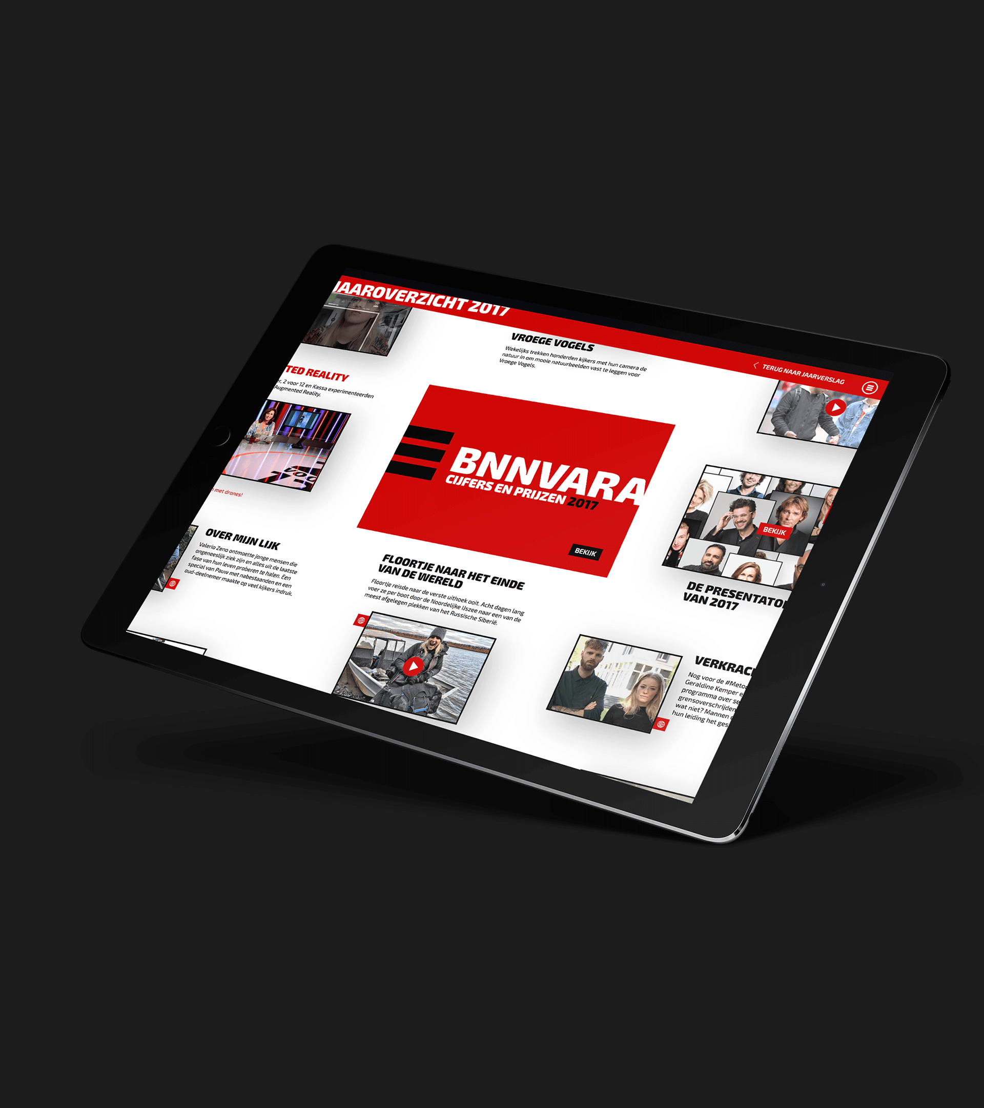
RESULT
The fact that today’s viewers demand content to be available anytime, anywhere and on every imaginable device, led us to our main challenge: how do we tie all these ways of experiencing BNNVARA content together?
The solution: the BNNVARA Ecosystem. A dynamic, never-ending landscape that visualizes all content that continuously takes place within the BNNVARA framework. A system that allows the BNNVARA content to look the same whether you watch it on your phone, tablet or television.
THE RESULT
The fact that today’s viewers demand content to be available anytime, anywhere and on every imaginable device, led us to our main challenge: how do we tie all these ways of experiencing BNNVARA content together?
The solution: the BNNVARA Ecosystem. A dynamic, never-ending landscape that visualizes all content that continuously takes place within the BNNVARA framework. A system that allows the BNNVARA content to look the same whether you watch it on your phone, tablet or television.
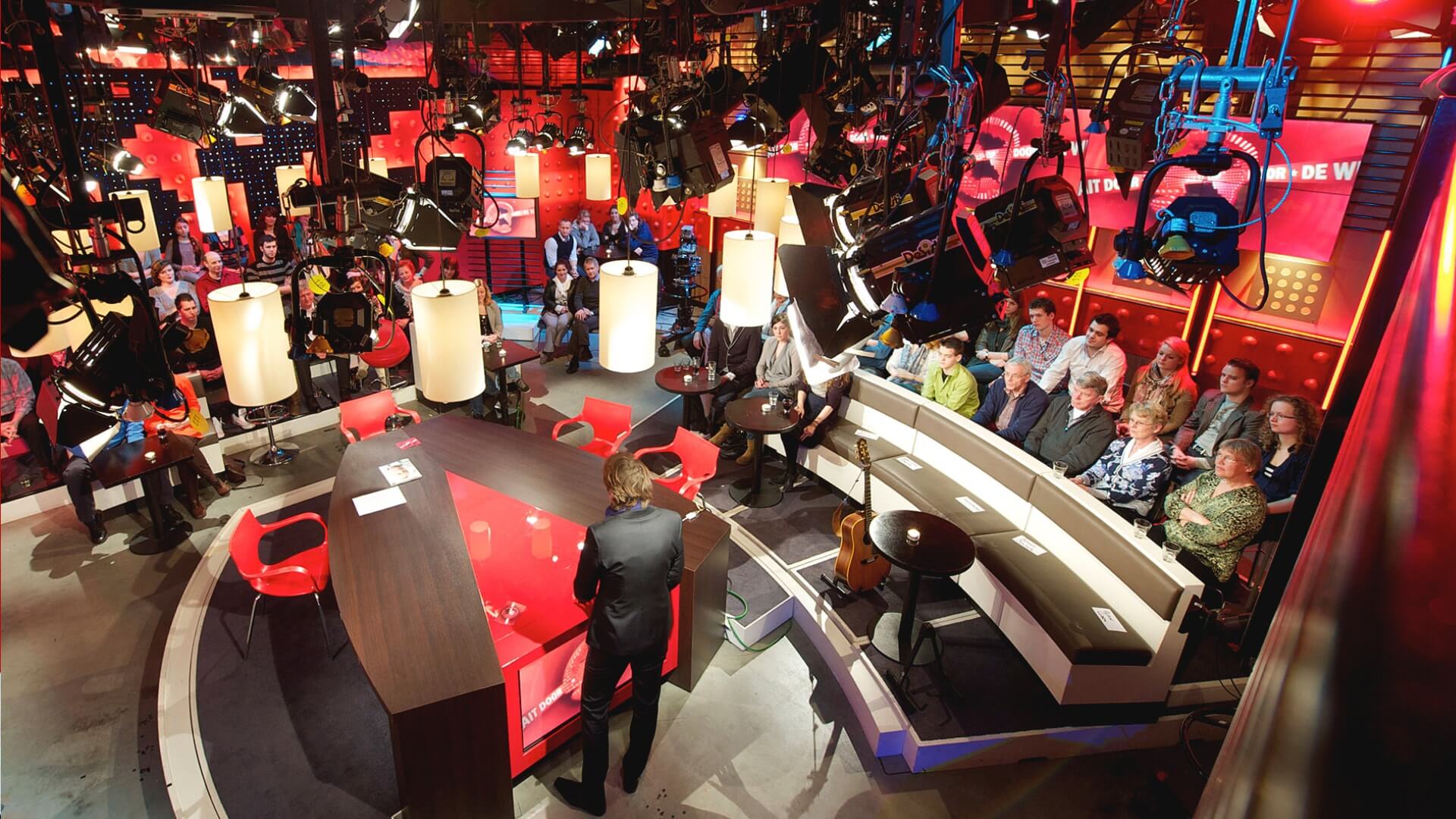
MOTION DESIGN
As the identity will mostly live on screen its motion behaviour was essential and a crucial part of the entire creation process. We created three different variations for the three channels that are part of BNNVARA each clearly belonging to the same family but also distinctly reflecting the content on each particular channel, and varying from a higher emphasis on being rebellious for younger content to emphasis on revelation for more serious content e.g. news related.
Dutch Public Broadcasting (NPO) has three different channels, all with their own unique positioning to show different content to their viewers. From newsy (NPO1), to narative (NPO2), to young and bold (NPO3). All idents are specifically designed for each channel.
Three distinctive motion and sonic treatments
to express the specific nature of the content.
Three distinctive motion
and sonic treatments to express the specific nature
of the content.
Three distinctive motion and sonic treatments to express the specific nature of the content.
Three distinctive motion and sonic treatments to express the specific nature of the content.