SPINAWARDS _ AWARD FOR DIGITAL CREATIVITY
Logo Design
_________________________________
Client: SpinAwards
Scope: Logo Design. Type Design. Creative Direction.
SPINAWARDS _ AWARD FOR DIGITAL CREATIVITY
Identity Design
_________________________________
Client: SpinAwards
Scope: Logo Design. Type Design. Creative Direction.
SPINAWARDS _ AWARD FOR DIGITAL CREATIVITY
Identity Design
_________________________________
Client: SpinAwards
Scope: Logo Design. Type Design. Creative Direction.
SPINAWARDS _ AWARD FOR DIGITAL CREATIVITY
Identity Design
________________________________
Client: SpinAwards
Scope: Logo Design. Type Design. Creative Direction.
SPINAWARDS _
AWARD FOR DIGITAL CREATIVITY
Identity Design
_________________________________
Client: SpinAwards
Scope: Logo Design. Type Design.
Creative Direction.
BACKGROUND
The SpinAwards is the award for creative digital work in the Lowlands. SpinAwards has been around since 1998 and the SpinAwards Award Night is being organized yearly by an independent foundation that is solely dedicated to stimulate creativity and effectiveness in digital media.
OBJECTIVE
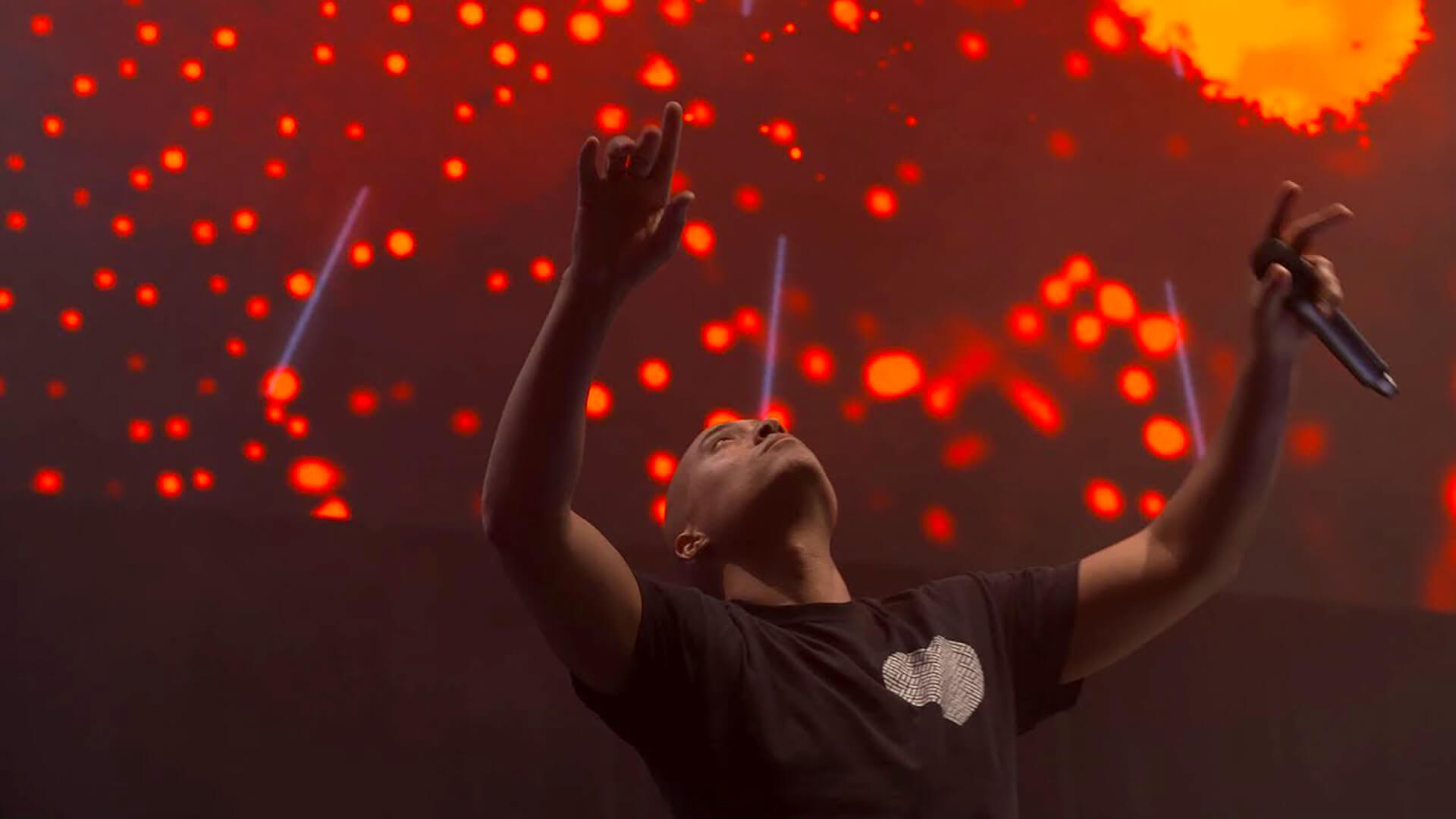
The aim was to develop a new visual identity, based on a renewed brand manifesto, that resulted in an renewed internal transformative purpose: We are digital. The aim was to create a visual style that highlights the attitude that unites creative digital thinkers, as disruptive pioneers in the todays era, making new connections while constantly being faced with questions that have never been asked before.
BACKGROUND
The SpinAwards is the award for creative digital work in the Lowlands. SpinAwards has been around since 1998 and the SpinAwards Award Night is being organized yearly by an independent foundation that is solely dedicated to stimulate creativity and effectiveness in digital media.
OBJECTIVE
The aim was to develop a new visual identity, based on a renewed brand manifesto, that resulted in an renewed internal transformative purpose: We are digital. The aim was to create a visual style that highlights the attitude that unites creative digital thinkers, as disruptive pioneers in the todays era, making new connections while constantly being faced with questions that have never been asked before.
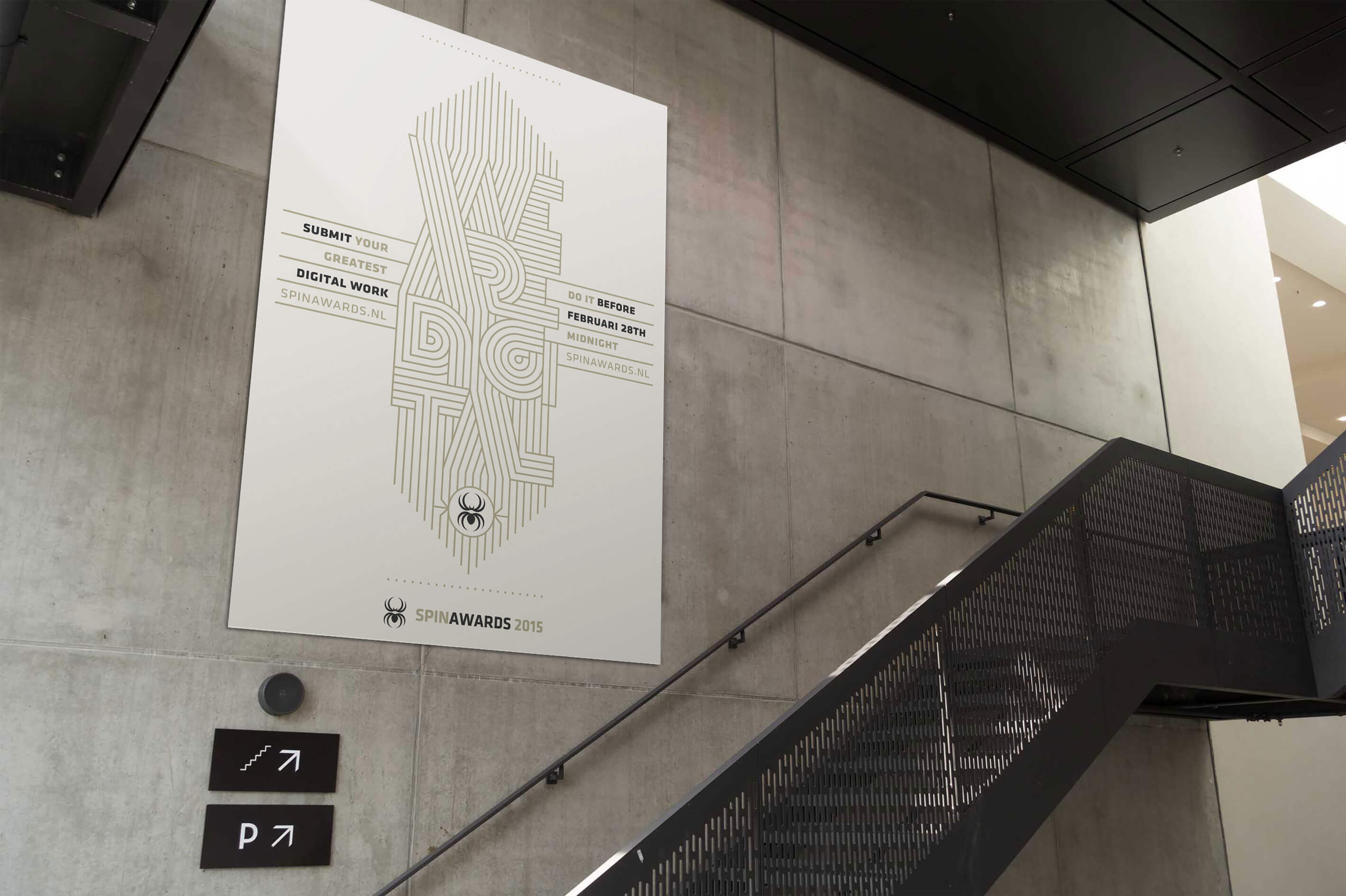
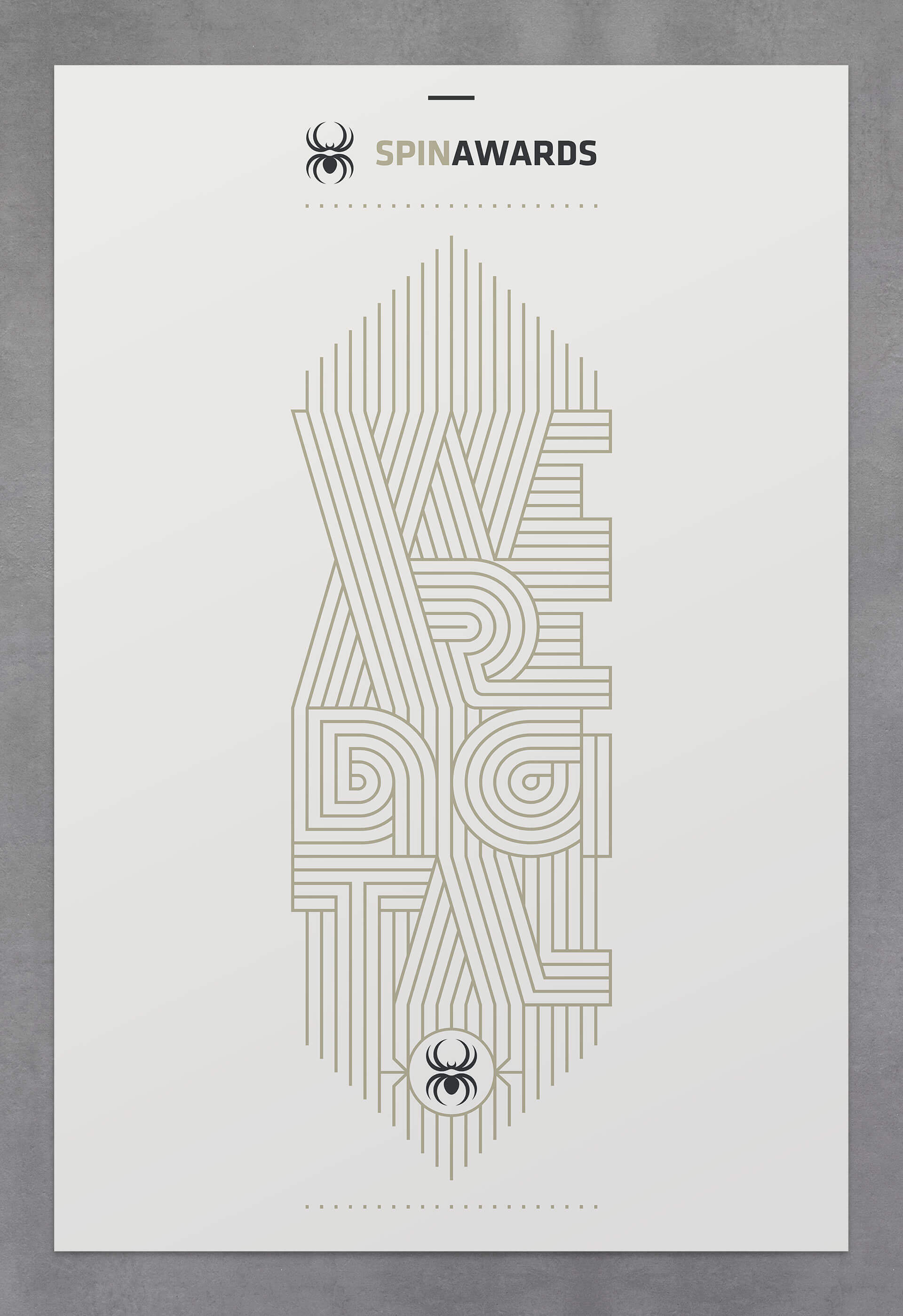
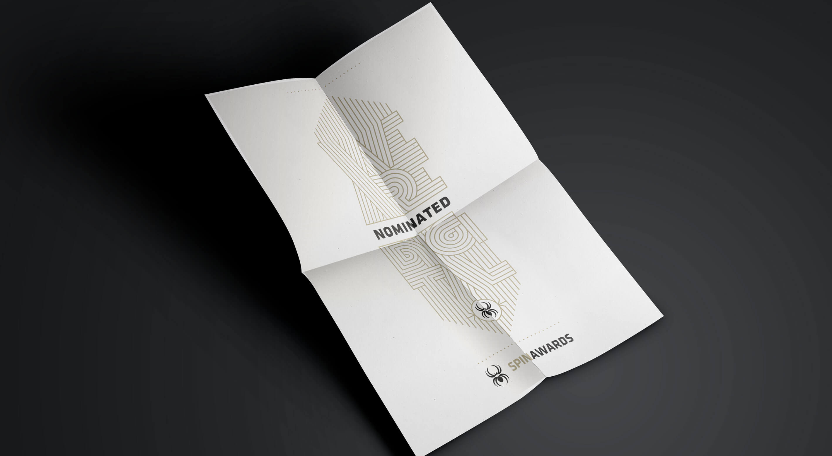
'A logo with an attitude digital creativity deserves.
A digital rollercoaster connecting all the dots'
'A logo with an attitude digital creativity deserves. A digital rollercoaster connecting all the dots'
'A logo with an attitude digital creativity deserves. A digital rollercoaster connecting all the dots'
'A logo with an attitude digital creativity deserves.
A digital rollercoaster connecting all the dots'
'A logo with an attitude digital creativity deserves. A digital rollercoaster connecting the dots'


THE LETTERING
The custom lettering was set out to be as iconic as can be. Because of the recognizability of the lettering, SpinAwards – as well as any of its initiatives – is identifiable from afar. Because of this it's easy to vary the color palette for any of the yearly announciations.
THE LETTERING
The custom lettering was set out to be as iconic as can be. Because of the recognizability of the lettering, SpinAwards – as well as any of its initiatives – is identifiable from afar. Because of this it's easy to vary the color palette for any of the yearly announciations.
THE LETTERING
The custom lettering was set out to be as iconic as can be. Because of the recognizability of the lettering, SpinAwards – as well as any of its initiatives – is identifiable from afar. Because of this it's easy to vary the color palette for any of the yearly announciations.
THE LETTERING
The custom lettering was set out to be as iconic as can be. Because of the recognizability of the lettering, SpinAwards – as well as any of its initiatives – is identifiable from afar. Because of this it's easy to vary the color palette for any of the yearly announciations.
THE LETTERING
The custom lettering was set out to be as iconic as can be. Because of the recognizability of the lettering, SpinAwards – as well as any of its initiatives – is identifiable from afar. Because of this it's easy to vary the color palette for any of the yearly announciations.


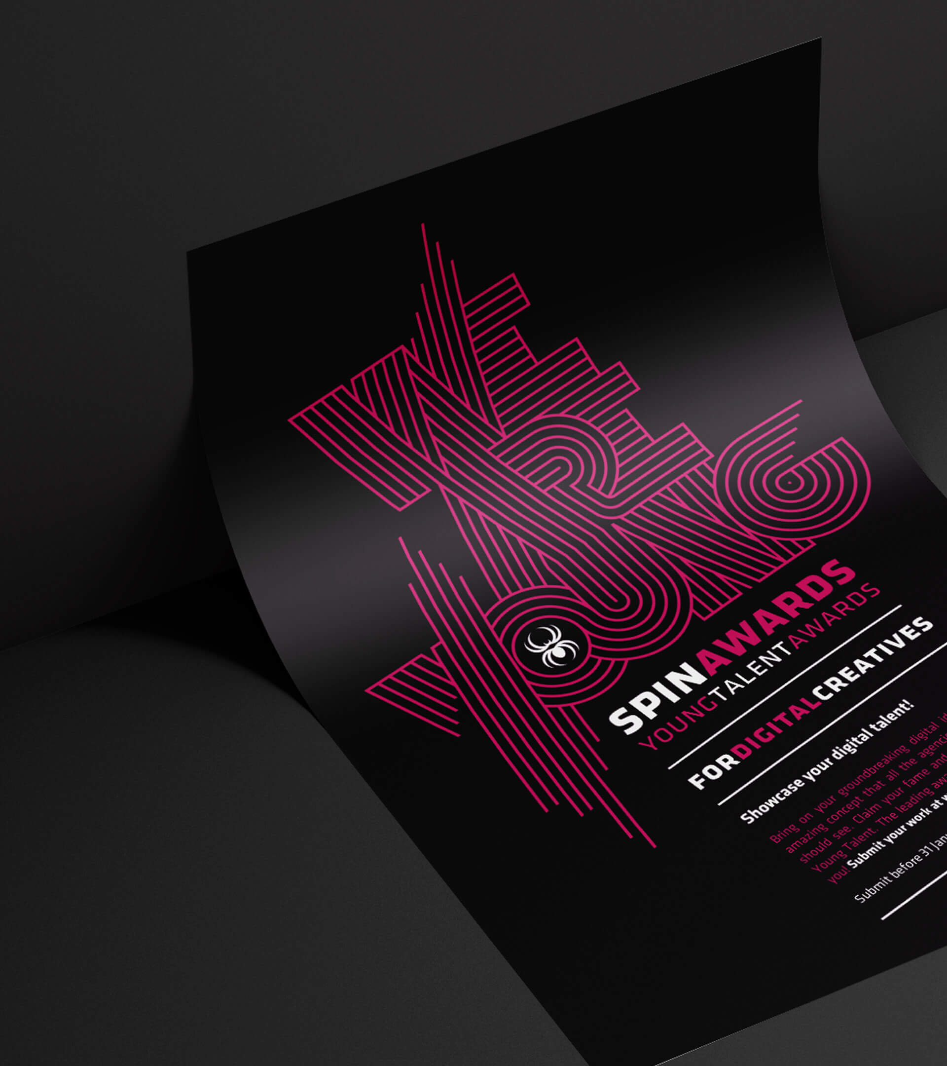
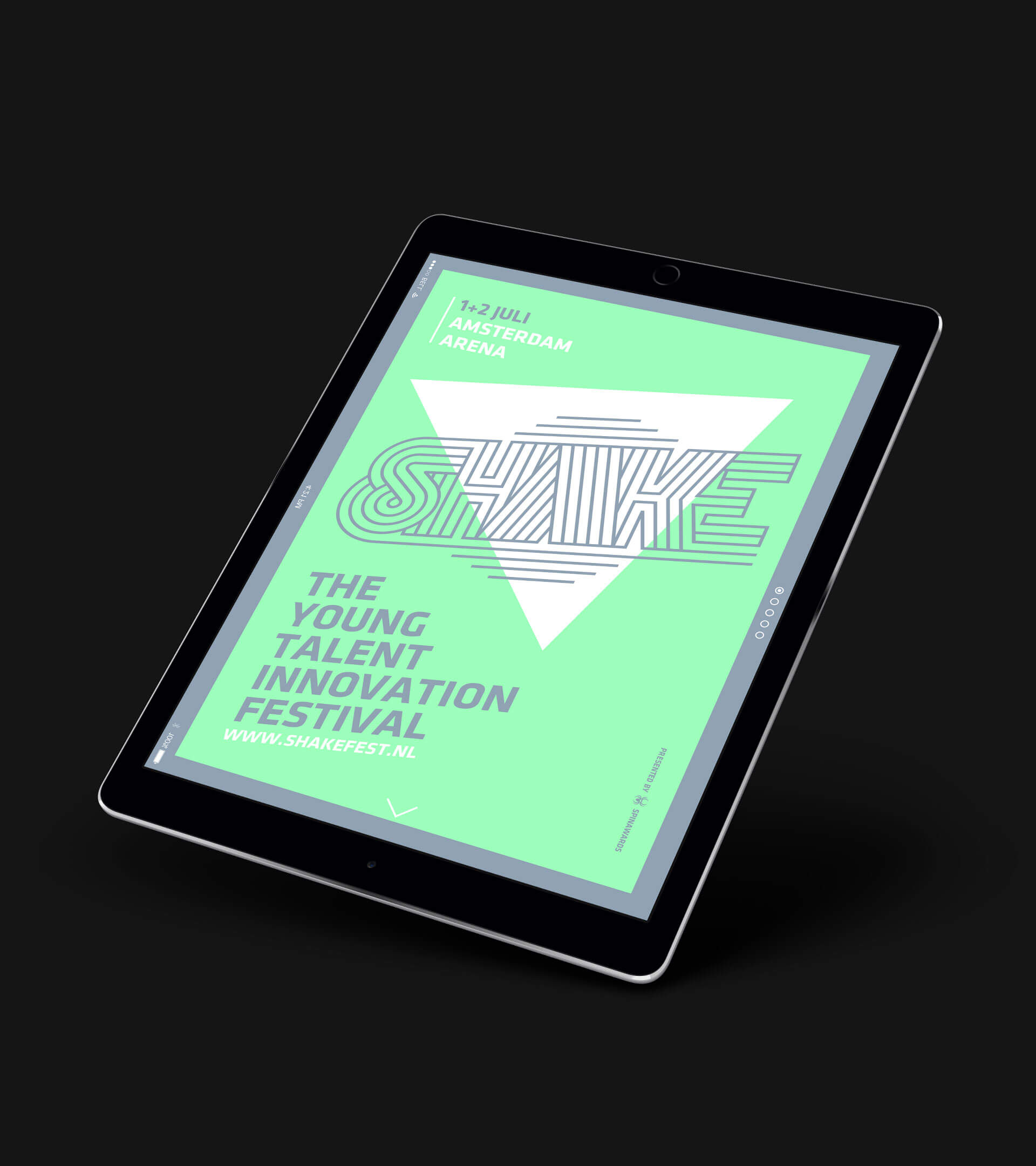
The distinctive typographic treatment is recognizable
across all initiatives of the SpinAwards Foundation.
The distinctive typographic treatment is recognizable
across all initiatives of the SpinAwards Foundation.
The distinctive typographic treatment is recognizable across all initiatives of the SpinAwards Foundation.
The distinctive typographic treatment is recognizable across all initiatives of the SpinAwards Foundation.